Today, I wrote seven thousand words. I saw an elephant but did not have my camera. I laughed loudly in a “silent zone” (I didn’t know it at the time!).
I was the note taker for the workshop. We were in the same space as the first workshop, but Pradeep had all the tables and chairs removed. We sat on the floor: professors, on-the-ground implementers, runners of entreprise incubators and the Canadian girl taking notes.
“Boy, was she typing fast.” You say. “Exactly. It’s like you were there!” I say. Continue reading →
Social Innovation Simulation is created using the Visual WordPress theme. Among other things, this allows for the beautiful infinite scrolling, and attractive gridded photographs. A key advantage of this format is that videos can be played right from the main page. The reader can easily sample multiple models without having to drill down.
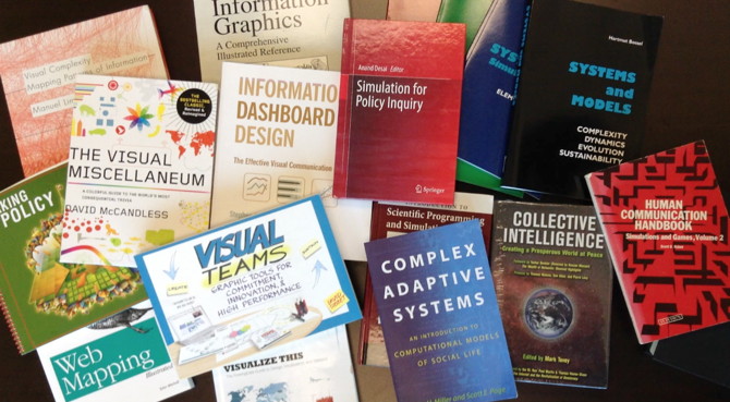
When you’re exploring a new space (like how to model social innovations for Labs), a great way to learn more about it is to read up on the individual domains that comprise that space. Here are some of the books we have in our library.
Example of many pieces of information organized coherently: a Sankey diagram
This is the second of four reflections by Benjamin Carr on principles which allow simulations and visualizations to help us understand complex systems.
Visualization can enable the user to make sense of a lot of data in a short period of time. Ideally, a well-designed structure is displayed which an individual can use to organize incoming information. Rather than having to take in many separate pieces of information and organize them individually, the information is already arranged coherently. This facilitates the task of remembering and comprehension. Continue reading →
This is the first of four reflections by Benjamin Carr on principals which allow simulations and visualizations to help us understand complex systems.
Simulations and visualizations are, for a variety of reasons, effective at engaging the user. I find the colors, shapes, and patterns pull my attention in a way that text cannot. Another property which makes these tools engaging is their interactive capacities, as can be seen with this stock and flow diagram. In such cases, the user has the ability to change the values of important variables. The user is positioned as an active component in the production of whatever result the tool generates.
We’d love it if you would join us for a live webinar about the simulation project. We’ll be demoing some of our prototypes, taking questions, and talking about where the project is heading next.
Today Pradeep woke me up to go and see the sunrise. “How the tables have turned!” I mumbled as I opened up the door to see his mischievous expression. “I’m not even really awake right now,” he told me. “I’m just running on willpower!”
We went for a walk with Kabir and Preeti, the team of architects who run Buildings as Learning Aids (I think I talked about them before). Pradeep was trying to convince them to stay on for his workshop on the rural schools project. He gave them and me a puzzle to ponder.
In January 2013, members of our team went to Toronto to explore policy options around employment for disabled youth.
Steve Williams discusses the prototype Sankey diagram he developed with Terry Stewart. This video illustrates how resource flows around disability could be visualized if the resources were available to gather full budgetary data.
Sankey diagrams are very useful for visualizing resource flows. In this example, we wanted to get a sense of where financial support for those living with disability in Ontario was coming from. How much was from public and private sectors? What role did employers play? Who were the intermediaries? How many government ministries were involved? How much of the resources were going to families and how much to individuals? The model shows this flow from left to right. The thickness of the lines represents the relative scale of financial resource from each segment. Note that in this case, the lines are illustrative only as the research is not yet complete for all segments. Viewers of the model can move the different segments around to improve visibility and hover over the connecting lines to see the values associated with the flows.
In early 2013, the simulation team went to Toronto to think about ways of illuminating the problems involved in finding employment for disabled youth.
Steve Williams discusses this prototype he developed which helps to illustrate ways in which disability has been framed.
This model represents the changing models of understanding and representing disability. The models, and the language we use to describe disability, have changed radically over time. The Medical model, characterized by phrases such as “mental retardation”, “impairment”, and “handicap”, gave way to the Social model (inclusion vs. exclusion). Now we are using the Human Rights model. The Human Rights model arises from the premise that all people have basic rights and that people with disability are entitled to those rights just as we all are. This model shows through media analysis the rise and fall of these terms in public discourse. The model also includes an example of using Google Trends to map changes over time along with geographical distribution of terms used. The model also shows how national and international agreements on the topic of disability have changed to reflect changing narrative framing. Awareness of these narrative frames—and the ability to change them—is a key element of the initial stages of a Social Innovation Lab.